
How can we help users follow complicated cooking instructions?
Timeline:
1 week
This was a modified Google Ventures design sprint that spanned over 5 days.
My Role:
I was the sole UX/UI Designer for this application. Responsibilities included:
Sketching and Wireframing
UI and visual design
Prototyping
Usability Testing
Background:
This project is a one-person, 5-day Google Ventures style Design Sprint project as part of the Springboard UX/UI Bootcamp. This design challenge was created by Bitesize UX who provided the problem, background information, user research, and design constraints to help a startup named Savr Recipes. Savr’s goal is to make it easier for people to follow new recipes and cook great meals at home. They have an active community of users who rate and review recipes for other users
I was responsible for synthesizing the research given to me, mapping out and sketching user journeys and wireframes, designing and building an interactive prototype, and testing my solution through a series of usability tests.
Problem:
Recently, Savr has seen some negative reviews about recipes that involve many steps, or more advanced techniques. Most of the reviews are around timing, order of steps, having to learn new techniques, and just overall preparing the meal. They’ve heard that people who were excited about a certain recipe end up disappointed with the outcome because of the unclear instructions or difficult techniques needed to create the dish.
They need help from a UX designer to help users accurately and easily follow the cooking instructions.

Research:
Interviews
In order to gain some insights around the current users, a series of interviews were conducted. The goal of these interviews was to hear directly from current users about their thoughts and pain points when navigating through the app.


Persona:

Competitor Analysis
After I read though the user interview report, it was time for me to do some of my own research around other recipe and cooking apps on the market that solved a similar problem. As I was scanning through apps, I tried to look for examples of how each product guided their user through a series of steps using visuals and instructions.


Day 1: Map

After I synthesized the research and had a clear understanding of users pain points and frustrations with the current experience, it was time for me to map out an end-to-end experience a user might have with Savr. Creating this map as a first step would help me fully understand the touch points the user goes through as they are creating a recipe from scratch.
I broke my maps into two separate user flows:
Preparation: all the things the user is doing prior to cooking
Cooking: all the things the user does while preparing the meal.


Day 2: Sketch

Crazy 8’s
Next, I needed to start sketching out some ideas as to what my interface would actually look that would solve the problems that I identified through user research. I started with a method called the “Crazy 8’s” exercise, which is a fast sketching exercise that challenges people to sketch eight distinct ideas in eight minutes. The goal of this exercise is to generate a wide variety of solutions to the problem at hand.

Solution Sketch
After completing the Crazy 8’s exercise and examining the solutions I came up with, I needed to decide on a solution and flesh it out. In order to solve and address the user needs discovered in the research and discovery phase, I needed to design a flow where users:
See a full description of the meal with pictures, a full listen of ingredients, kitchenware needed, cook time, prep time, serving size, nutrition facts, listed step-by-step instructions, and reviews left by people who have made the dish.
Can follow a “step-by-step” function that takes the user through a series of guided videos with listed out instructions to go along.
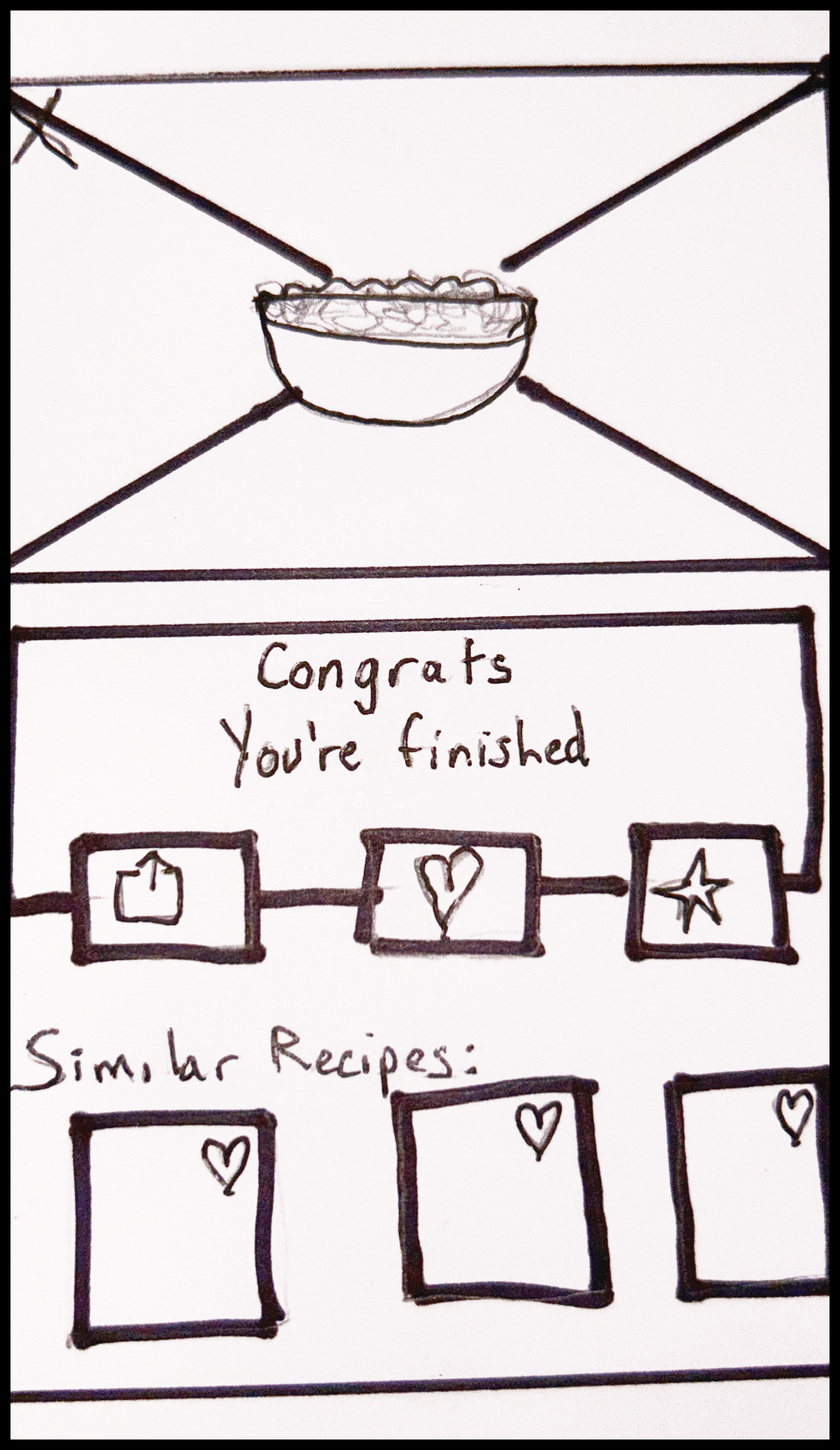
Reach a confirmation screen that shows a picture of the completed dish and allows you to share or favorite, and gives you some recommended dishes to try next time to accompany your meal.


Recap
After reading through the research and conducting a competitive analysis, I needed to redefine the problem into some actionable insights. I did this by creating 3 How Might We statements.
How might we inform users of all of the kitchenware and preparation needed to make a dish?
How might we make sure users are on the right track throughout the entire process of cooking a dish?
How might we provide users with all the information needed so they are confident in their ability to correctly make the dish?
Day 3: Decide

Now that I had a solution sketched out, it was time for me to create a full storyboard/user flow of the steps a user would take to search, identify, and make a recipe from scratch. This storyboard will serve as a lightweight, sketched wireframe that I will use to build my prototype later on.

Day 4: Prototype


Notable Design Elements
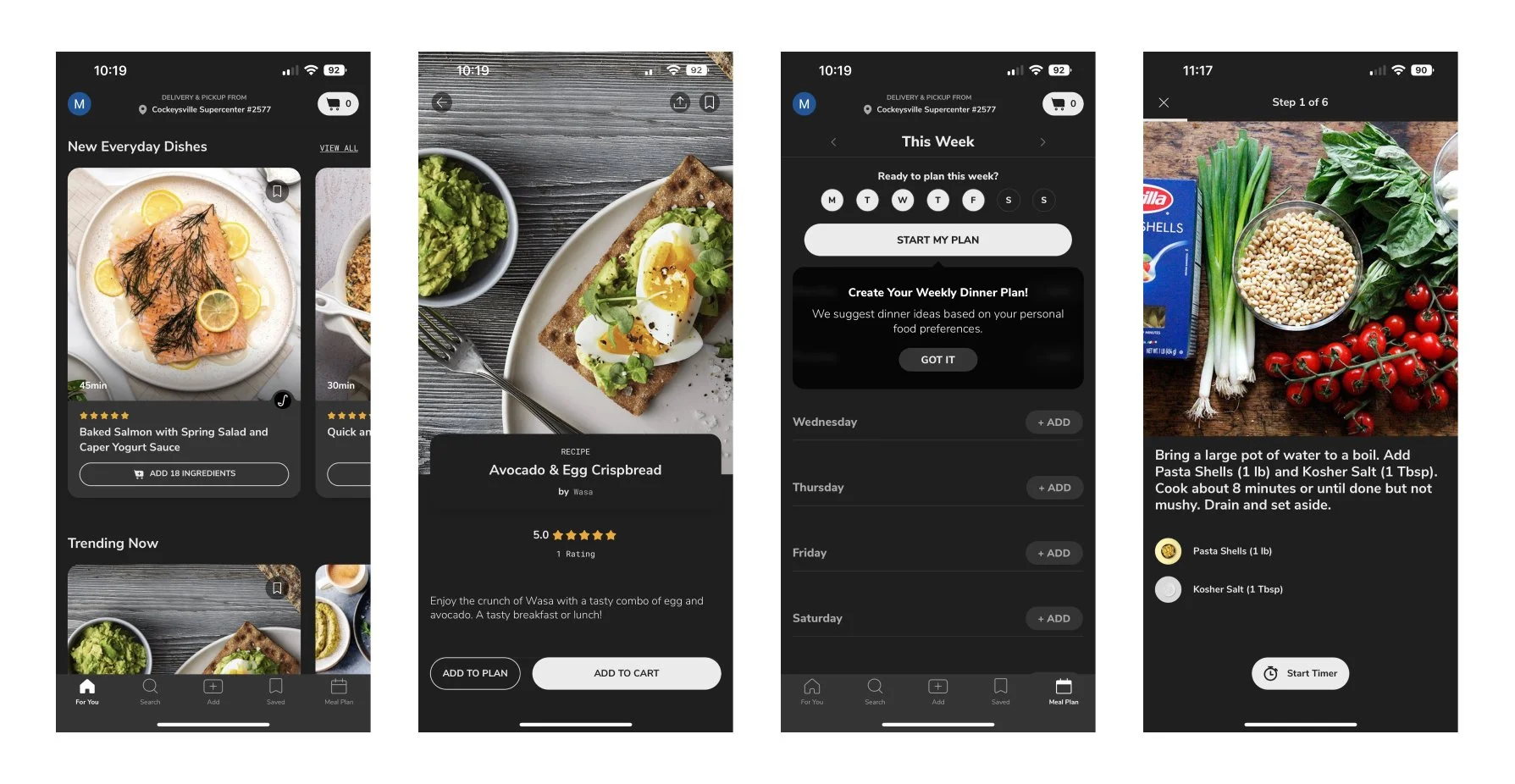
When a user taps on a recipe to view the full details, all the necessary information is present to them in a clean and easy to digest way. They can see how long it takes to make, the serving size, a list of ingredients, written cooking instructions with videos, nutrition facts, a list of kitchenware needed, and reviews from people who have made the recipe before.
Step-by-step mode that guides users through the instructions of how to prepare the meal. The user can toggle between instructions and the full list of ingredients if they need to refer back to something. This feature divides the instructions up so the user does not feel overwhelmed by long and complicated recipes.
Voice activation allows the user to go hands free and go to the next step, pause the instructional video, or read the instruction out loud. This feature prevents the user from having to constantly wash their hands or walk back to their device
Day 5: Test

About the Test
When doing a design sprint over a 5 day period, it’s critical to start recruiting and scheduling participants early on to avoid cancellations or delays in your project. I was able to recruit 5 people in my network who regularly cook meals at home, and are interested in trying new recipes.
Due to the time limitations, I conducted these test virtually through Zoom. Users opened the Figma prototype on their computer, and by sharing their screen I was able to see how they interacted with the prototype. I talked them through a series of tasks like “Search for a new recipe” and “Start cooking this recipe”. As they were going through these user flows, I asked them questions like, “What features do you find helpful here? or “What, if anything, caused you frustration?”
Overall, conducting these usability tests helped me ensure that the design elements I added to this user experience helped solve the problems I identified through my user research
Clarity on Voice Activation
As I was walking users through the the “Step-by-step” feature, I asked them about their usual process for following cooking instructions. I wanted to make sure that users would be able to follow instructions without having to constantly wash their hands and refer back to their phone, which is why I created the “Voice Activation” feature. However, as users were going through this flow, they did not fully understand all that was capable with this feature. I needed to add a “help” button for users to read about all they can do through Voice Activation.


Set a timer
After talking with users, I learned that having easy access to a timer while making a recipe is very important. When asked if there are features that feel like are missing, two of my users called out that a simple timer at each step would be beneficial.


Learnings:
Time Management
Due to the nature of a design sprint, there was some very strict deadlines for deliverables. A lesson I took away here was to always keep an eye on the clock as you’re working through all phases of the design process to make sure you don’t get hung up on one thing and cause a snowball of delays.
In order to stay on track, I listed out my deliverables that were due each day and set a time limit to each. This helped me not get stuck on one thing and made sure I gave each step of the sprint the time it deserves.
Get Your Thoughts Out
One part of this design spring that I found very valuable was the Crazy 8’s exercise. Although it is intended to be done in a group setting with multiple participants, I still found it to be very valuable in identifying a solution to the problems I identified in my user research.
This exercise did a great job at getting all of your thoughts out on paper. Even if you don’t end up using a sketch you created, it helped you narrow down what solution would be best.
Overall, by giving me limitations and simplifying the design process, this sprint taught me that through Lean UX I can still yield an effective product within a very short span of time.